


The artwork needs to complement the architecture so that the two co-exist symbiotically. I found that the nature of the new building lends itself to bold, abstract imagery. Damask patterns are formed from symmetrical block repeats, which can cover a surface more densely than other types of pattern. One of the advantages of this particular design is that it is easily scalable; it can be expanded to cover more of the surface or reduced to cover less, without losing its impact or integrity.
It is important that the pattern is visible from a distance as people approach the building, while also having an element of detail that is revealed on closer observation. It is formed from motifs of different scales; larger, bolder forms are framed and intersected with more complex, intricate detailing. From a distance the pattern is striking and instantly recognisable, while the detail provides visual interest when viewed at close quarters. The pattern sweeps across the two facades, uniting the surface and giving the sense of wrapping the building. The mass is concentrated on the corner, although the focus is on the principal facade and accentuates the primary entrance.
The pattern has been simplified for use on a contemporary building and adapted for the technical purposes of carving into stone. It will be carved at different depths to give a sculptural feel and add a visual richness to the surface, creating a dynamic play of shadow and light that will animate the facades. The motifs have been separated into four layers which correspond to a specific surface depth. The first layer is the face of the facade itself; the second layer sits proud of the facade; and the remaining two layers are cut into the facade. The various depths will weather differently over time, further accentuating the pattern and allowing it to take on a life of its own.’
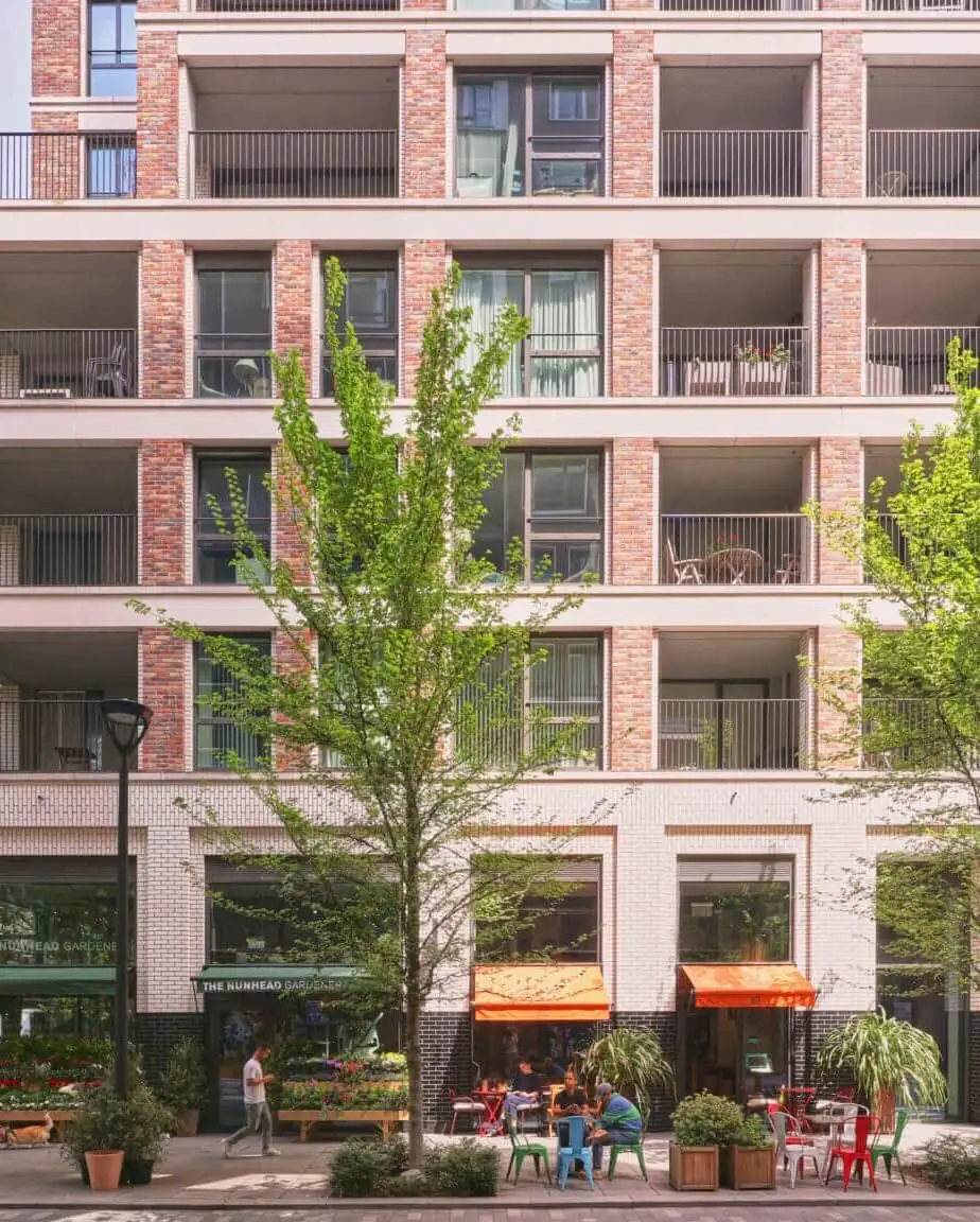
You can find out more about our Hanover Square project on our website.
Biography
Catherine Bertola was born in Rugby in 1976. She studied Fine Art at Newcastle University and currently lives and works in Gateshead. She has collaborated on a broad range of commissions and exhibitions, both nationally and internationally, with institutions such as the Museum of Arts and Design (USA), Kunsthalle zu Kiel (Germany), Artium (Spain), the National Museum Wales, the V&A, the Whitworth Art Gallery, the Government Art Collection and the National Trust (UK).


