Architectural Review’s (AR) Art Editor Tom Carpenter shares his thoughts on what makes a drawing stand out when sifting through all the material arriving at the editorial office’s desks every day and from around the world. He picks up a book he has brought along for this blog piece interview. An elegant tome by Dogma, a Belgian studio. The drawings on its pages are immediately captivating. Not the stuff of usual architectural drawings but instantly more artistic in feel. Something you might find in a Cork Street art gallery catalogue. Tom explains, “They mix worlds. Drawings based on photographs. Technically precise and with an aesthetic quality.” We agree the images remind us of the linear quality of Patrick Caulfield’s paintings and share some of the joy of these works. No wonder Dogma have caught Tom’s trained eye.
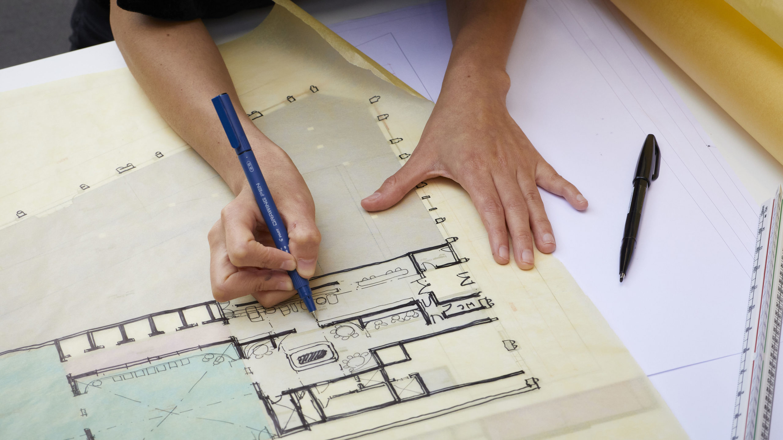
I ask Tom about working with more conventional architectural drawings on AR. The kind that are cleaned up for publication at the end of a project. He says that the quality of these drawings matter a great deal in terms of what is selected for publication. “Drawings are about understanding how a building works. They work in combination with photos; but we never use, for instance, elevations as photos are better to show this aspect of a project. We like lots of plans, sections and to line up plans and sections so that they work on a similar scale on a page; although the sections do end up small.”
We look at some issues of AR from the archive. Tom shows me examples of the AR “Manplan’ series from a time in the late 60s when the magazine wanted a more photo-journalistic approach. Looking back at these issues, the architectural drawings were incredibly small, tightly sandwiched with other larger visuals keen to tell a more political story of the wider social concerns around architecture, of places in use, parts of cities changing. Then Tom picks up an earlier archive copy of AR from a time when Gordon Cullen led the celebrated Townscape campaign that challenged the perceptions of planners and politicians. Tom’s eyes light up as he shows me the quality of the illustrations on the pages of the magazine. Bespoke freehand drawings that liven up the pages giving them an atmosphere with views and vistas of places as well as maps and diagrams specially commissioned by the editorial team. Tom says, “Illustration was prominent then. They did graphics from scratch. It’s good to have technical and visual interest and also the space to contrast text.”